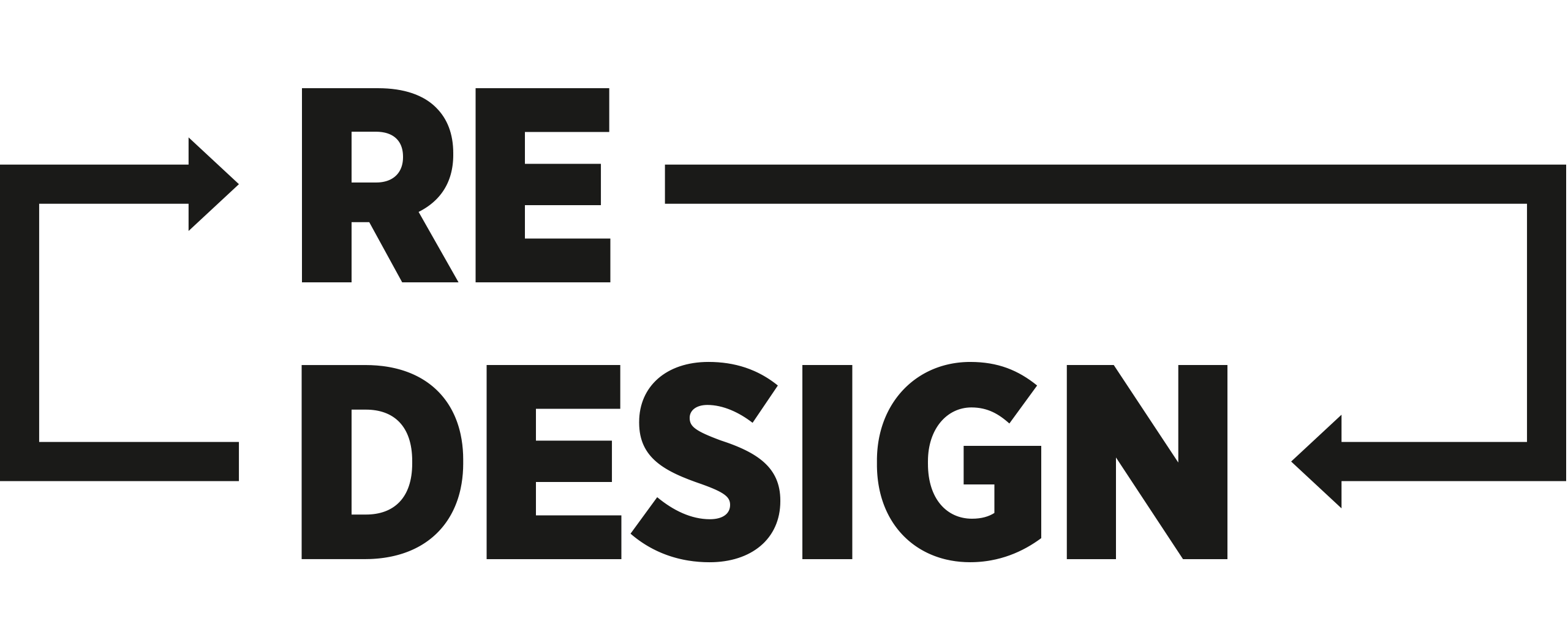
Design, redesign, development of a visual language
When people hear the word “redesign”, they often think only of the revision or new design of a company’s logo, its colours and the font. But a true redesign encompasses much more.

GRENKE AG has been around for 40 years now. The company has evolved over the years, new business divisions were added and new products were developed. The design has to keep up with this evolution and make it tangible.
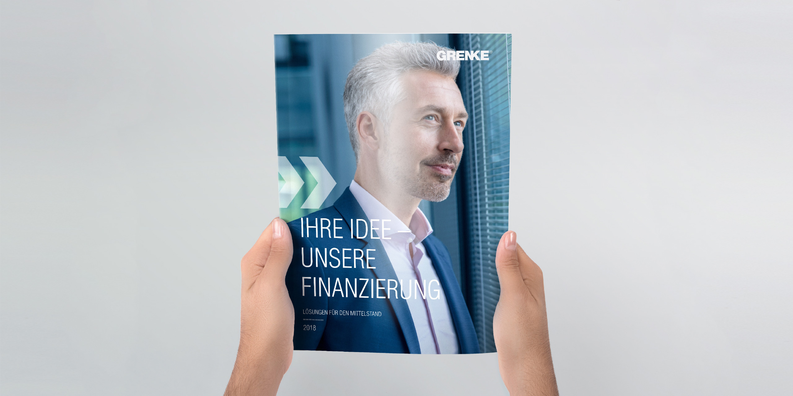
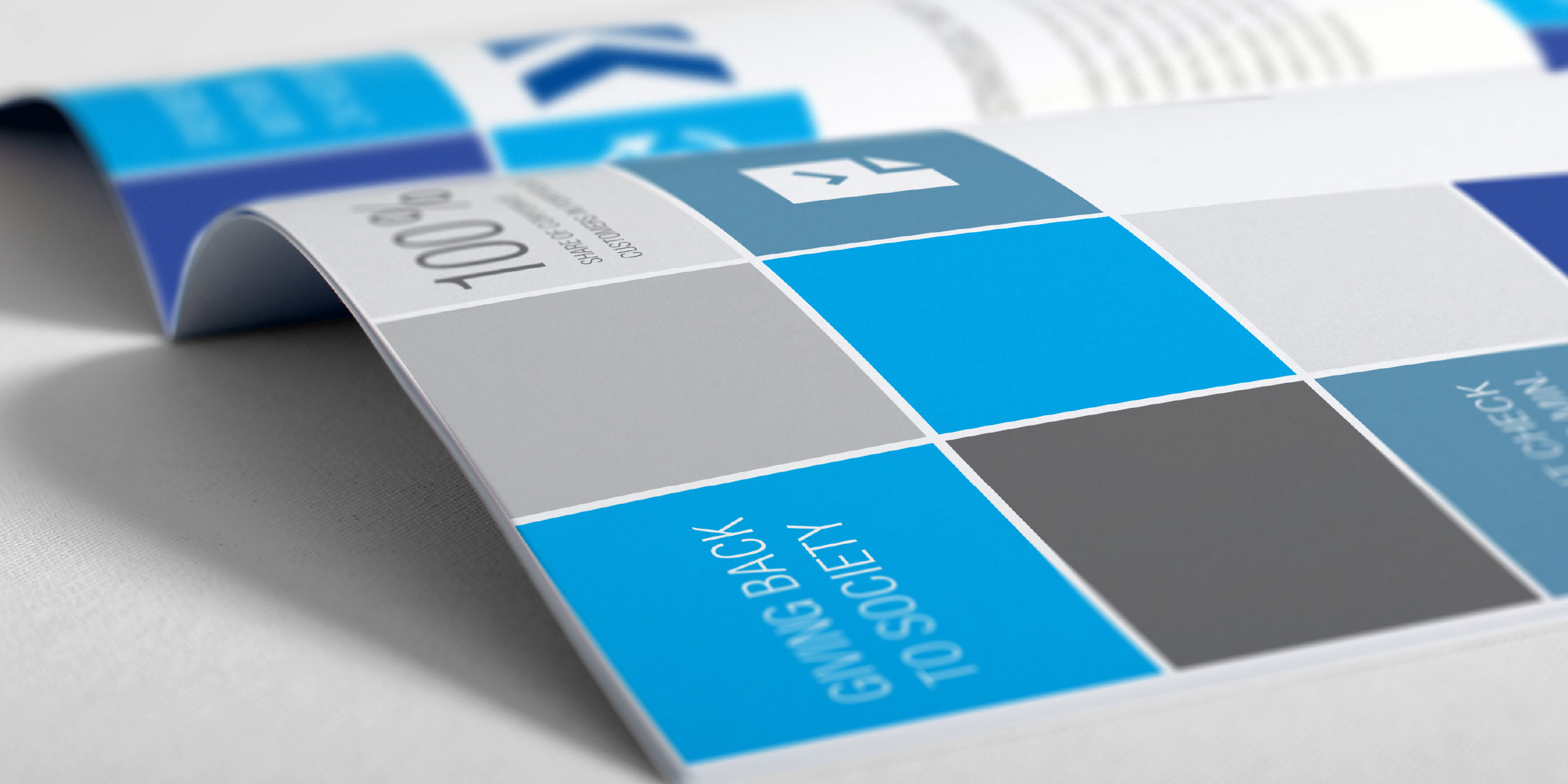
There was already a broad selection of communication media and channels. We analysed these in the run-up to the redesign. We questioned everything, in terms of both content and design. We defined goals together and checked how we had implemented them. The result was a complete modernisation and simplification of corporate communications that can be scaled any time.
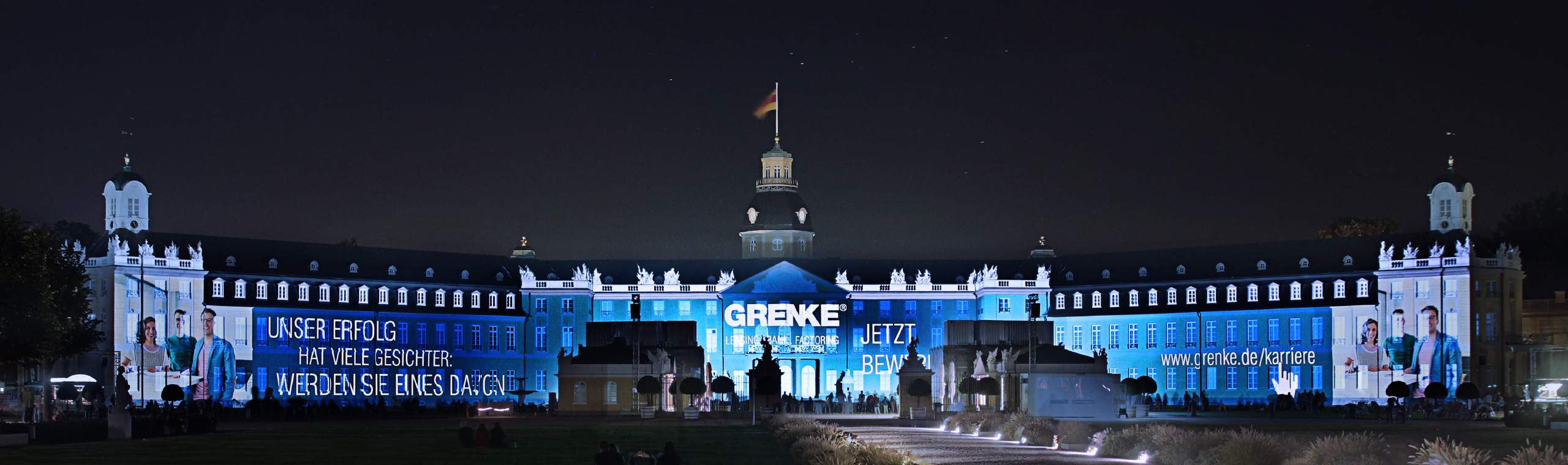
Together with GRENKE AG, we developed and implemented a new communication concept. Such a complex redesign involved a number of big milestones, such as the redevelopment of the visual language, the creation of the CD manual, the complete design development, the design of advertising material and POS material, an advertising concept and a building signage concept, including a guidance system inside the building. A redesign is never fully complete. It is continually enhanced and expanded in day-to-day work.
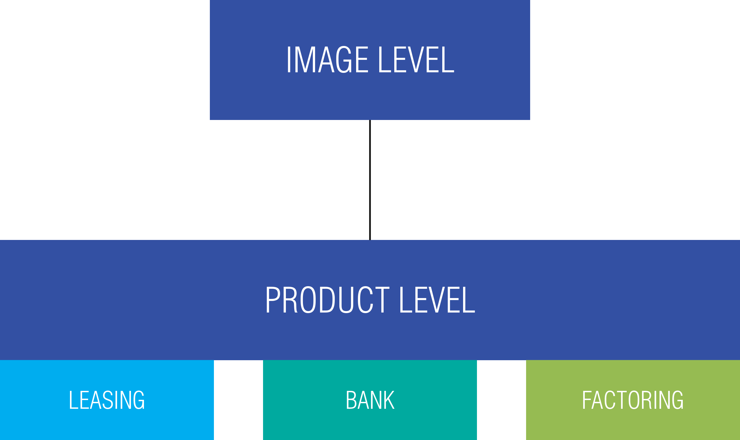
New business divisions bring new target groups with individual needs and requirements. One mistake that is frequently made is to change the form of address such that all target groups are addressed in the same way. Our client was also facing this challenge. To resolve the problem, we restructured the content of the different levels. The individual target groups are now addressed directly and separately. To visualise this separation, we have assigned a colour code to each level and each product area.

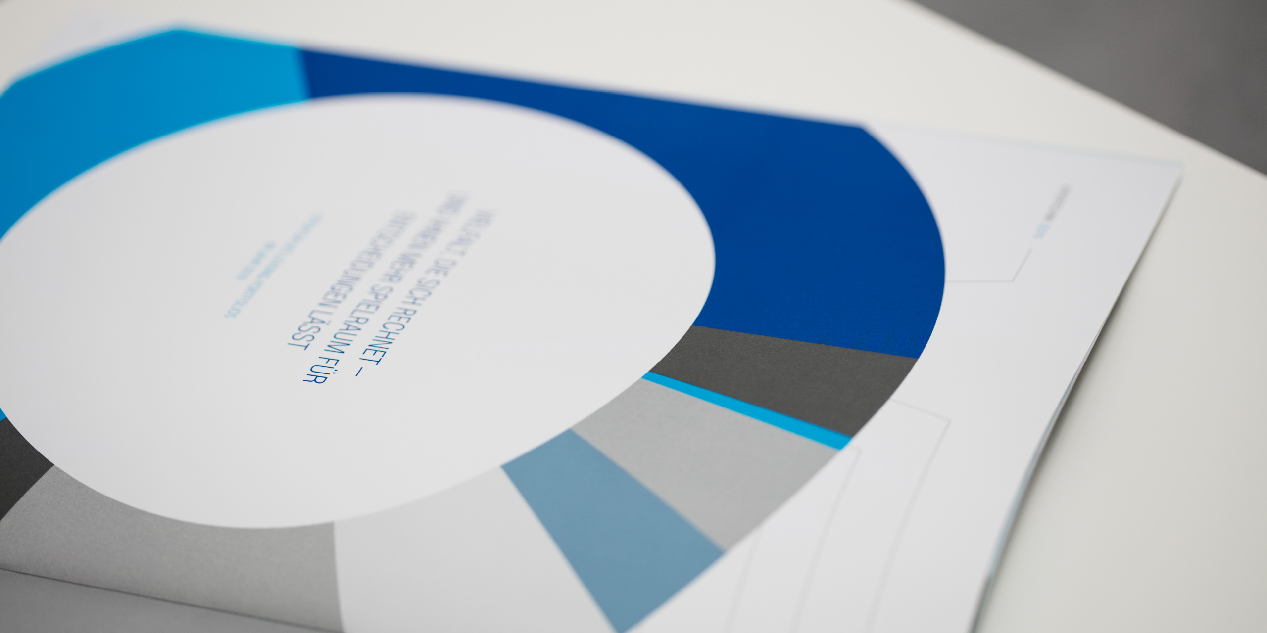

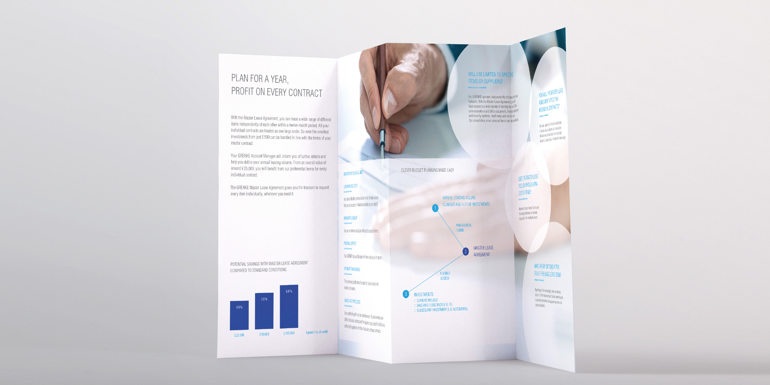
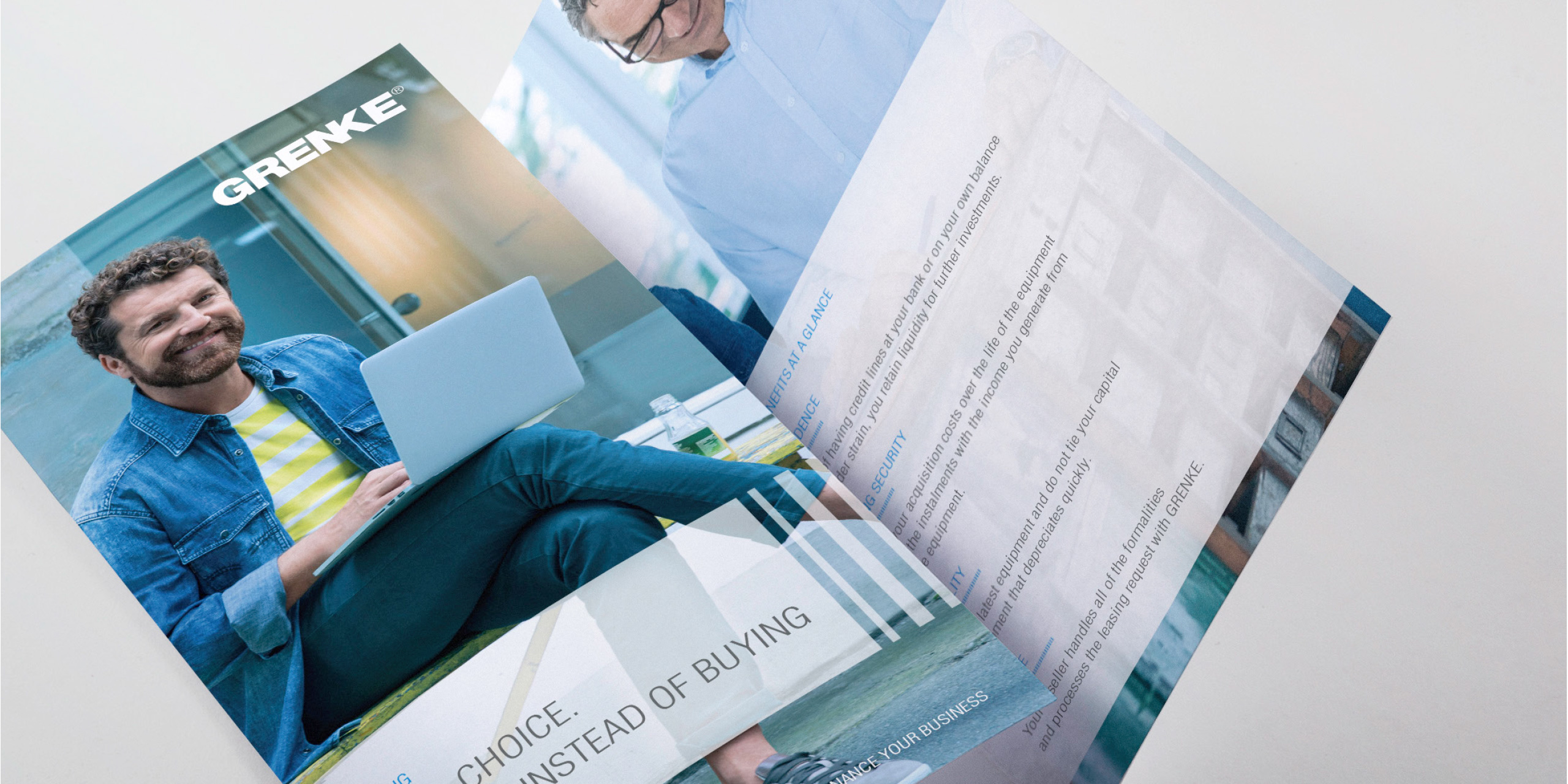
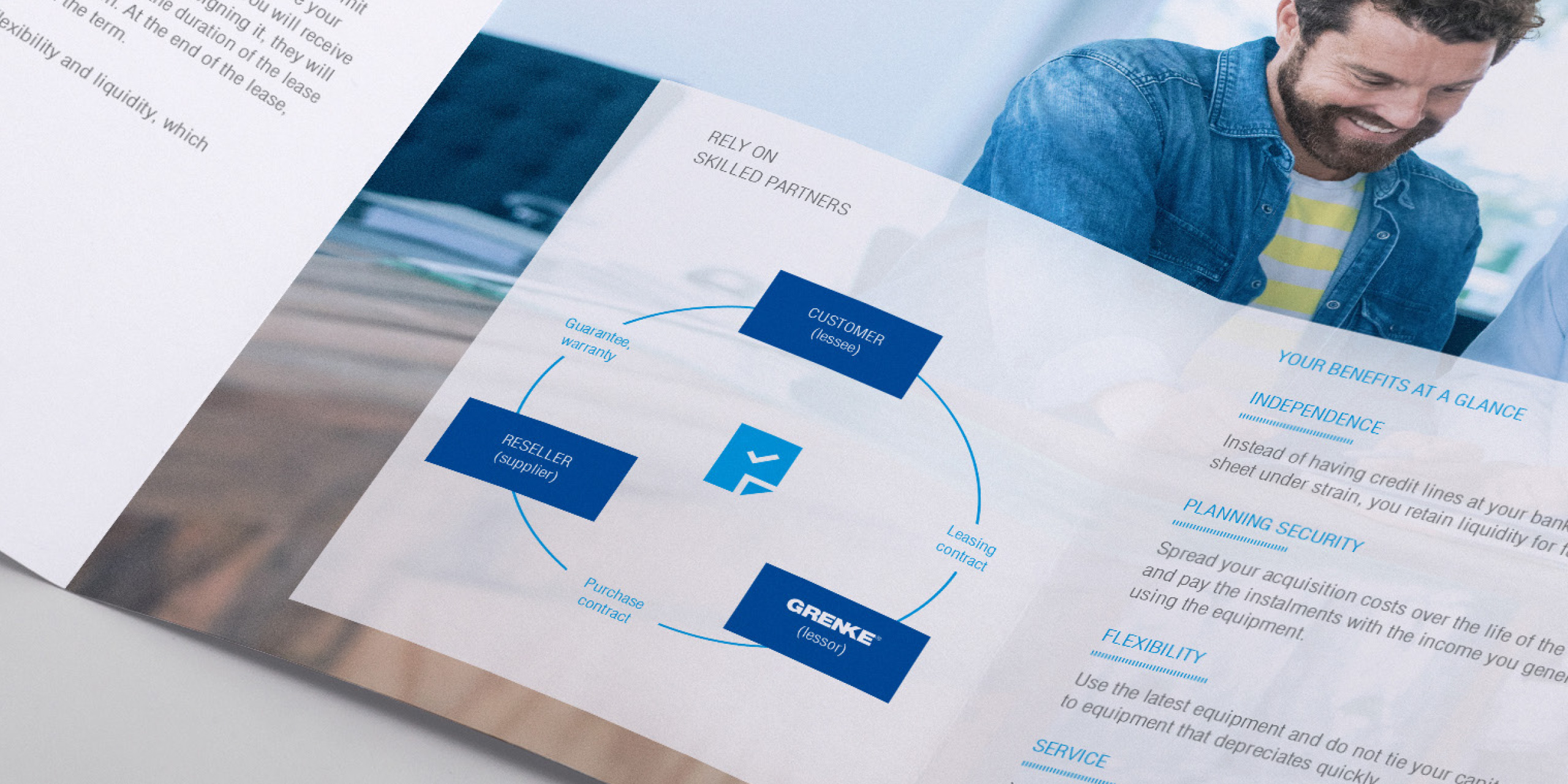
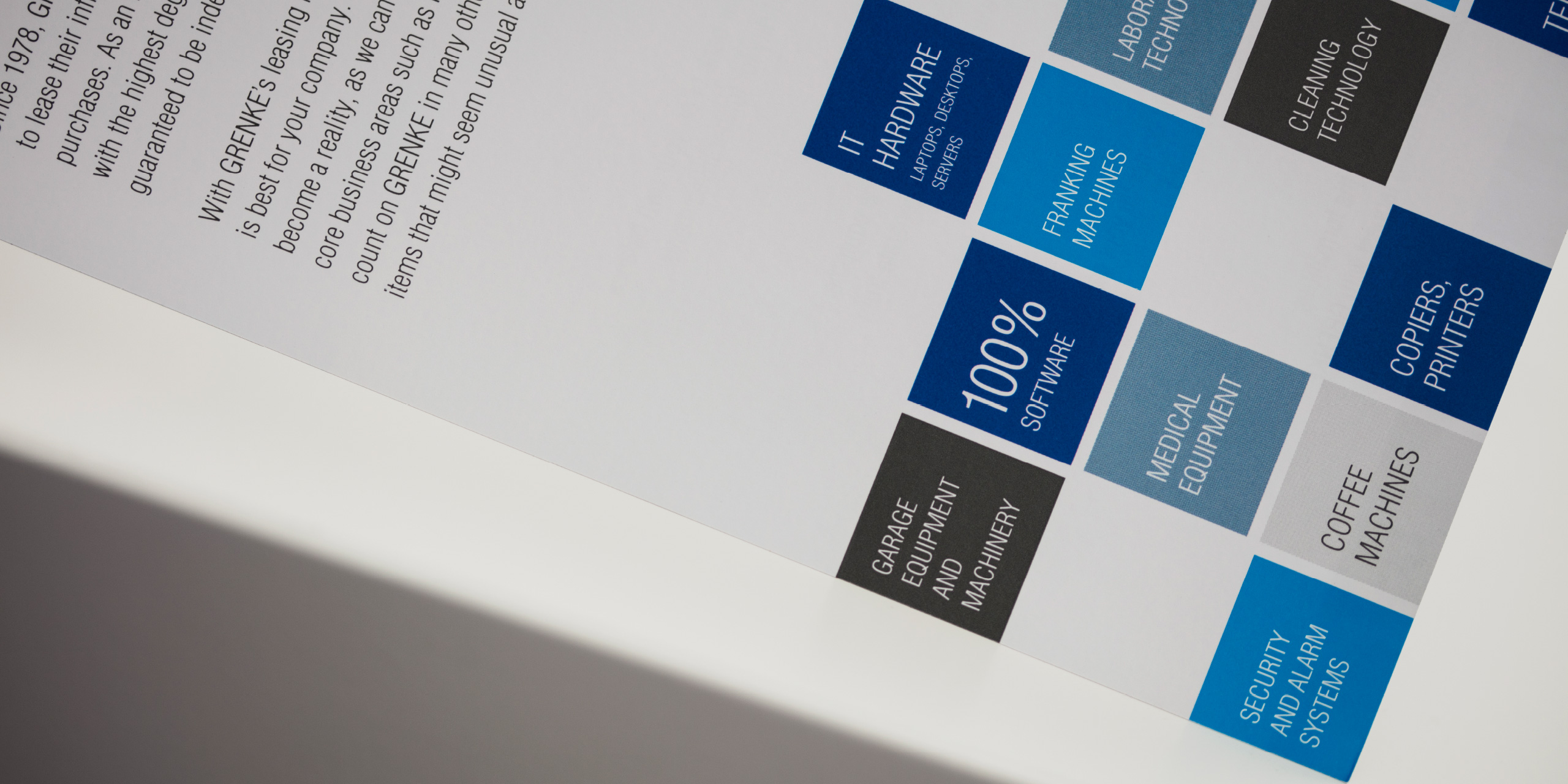
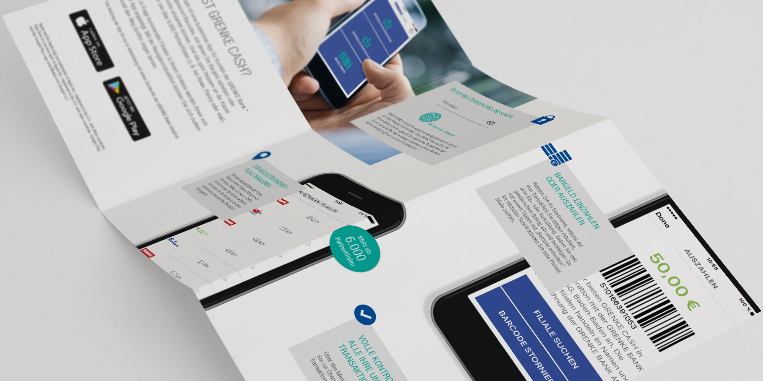
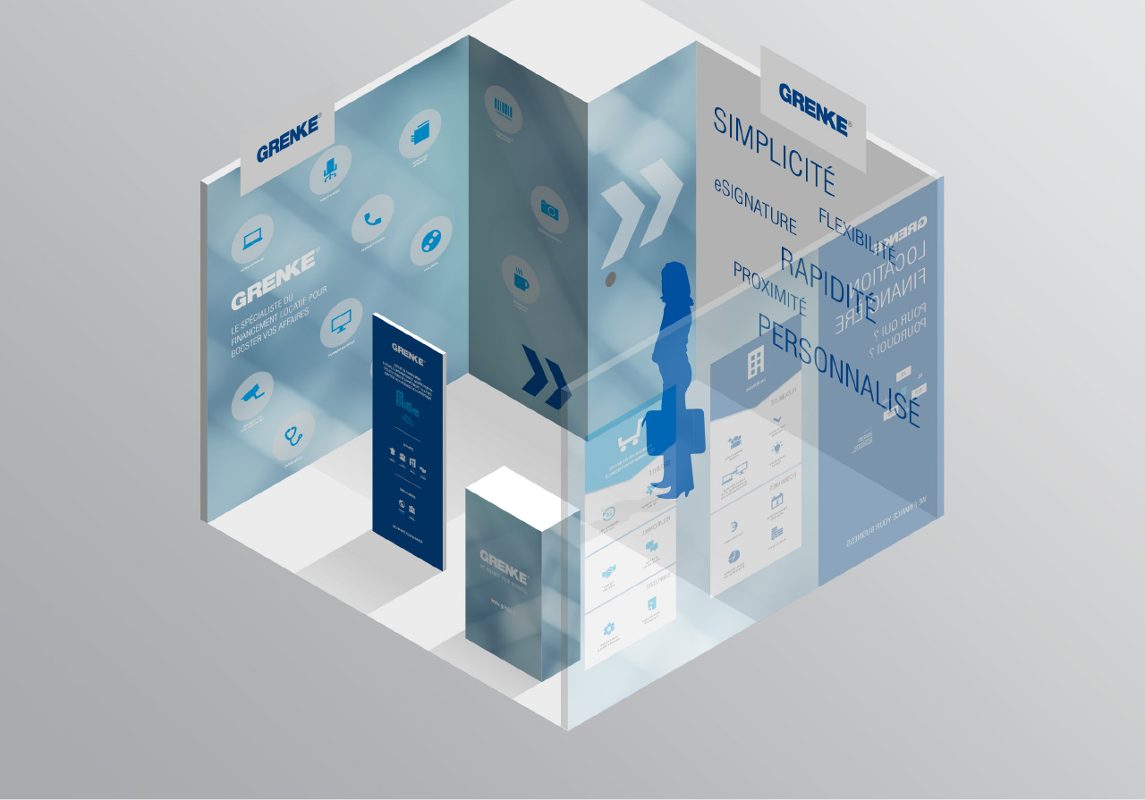
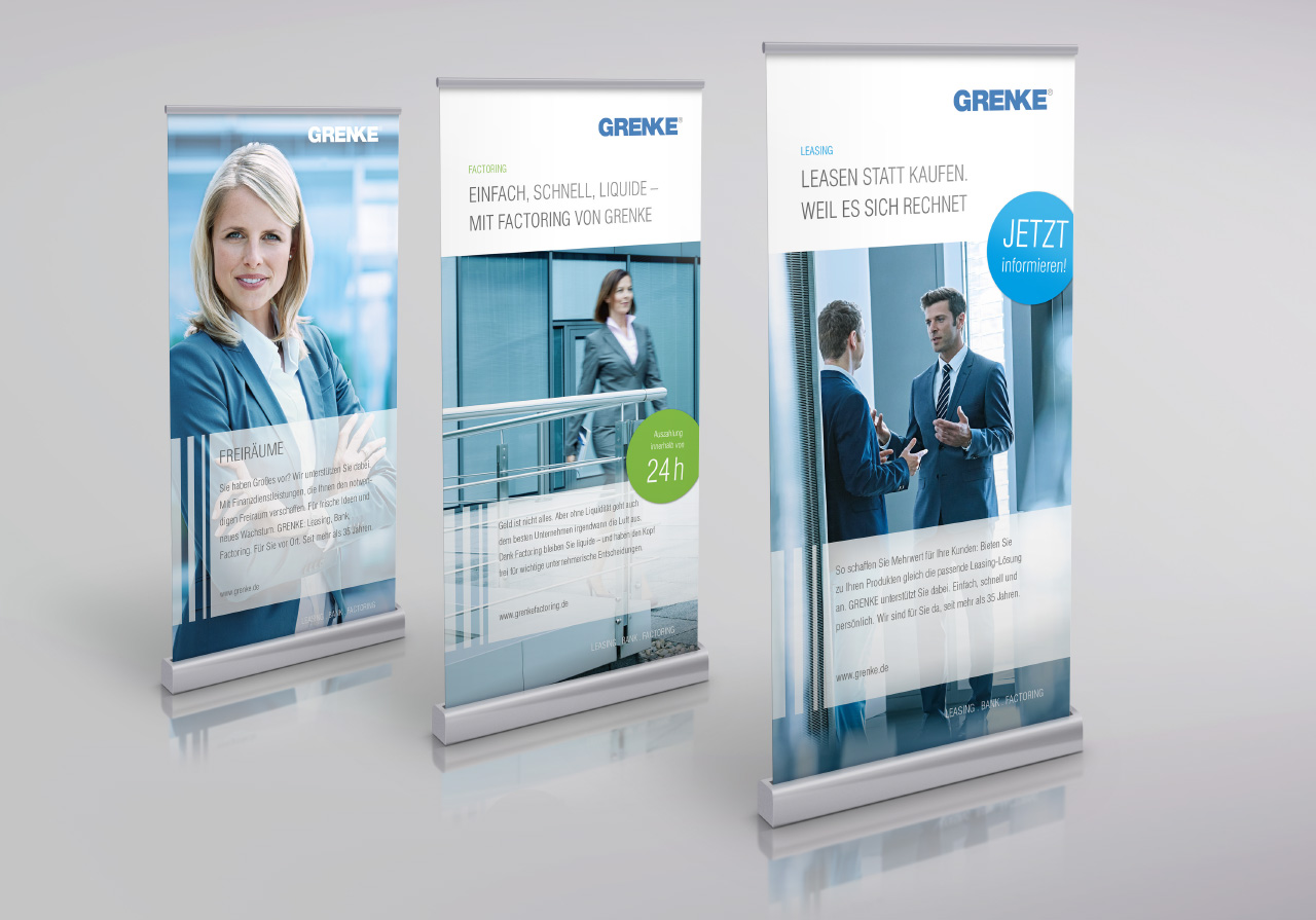
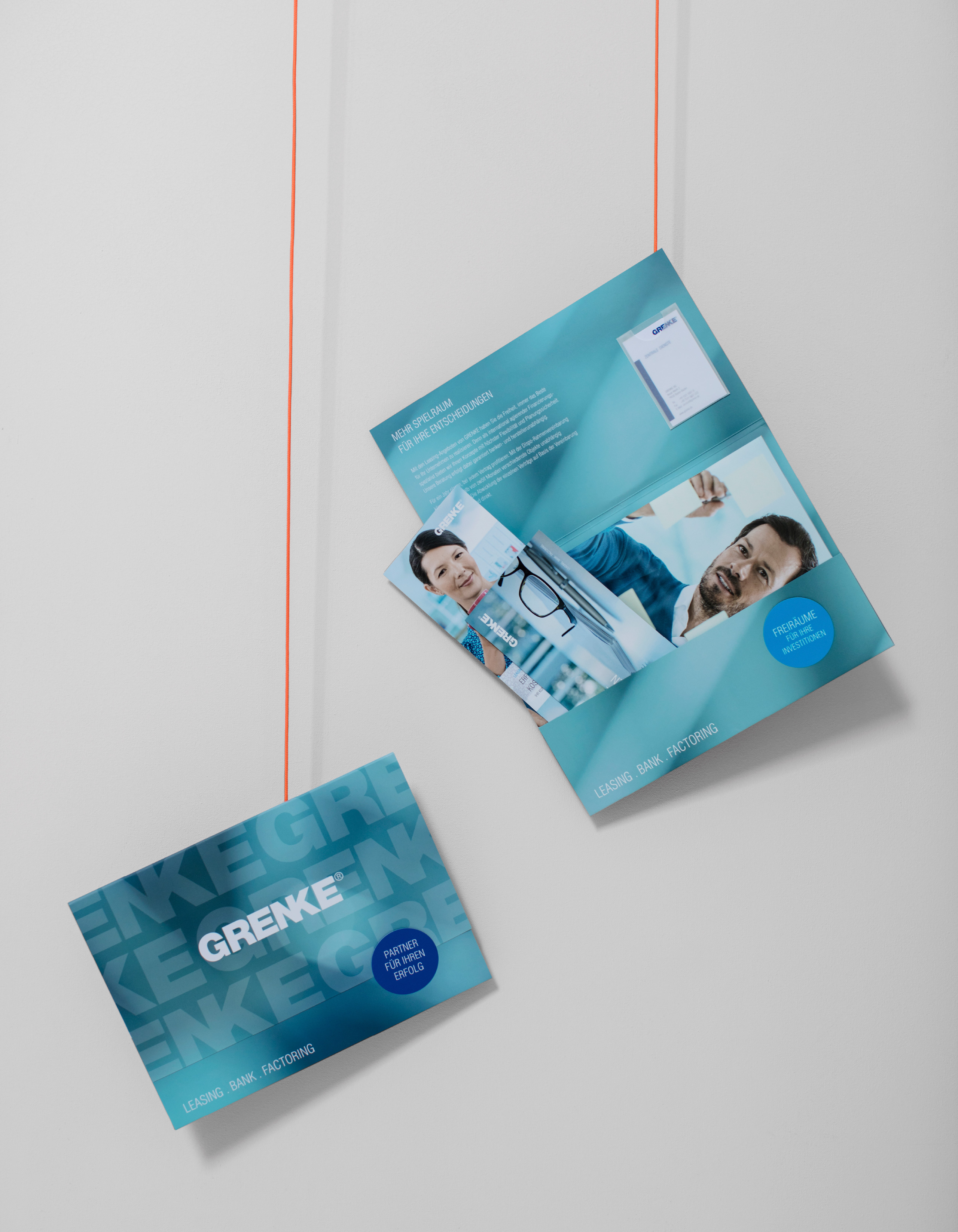
The redesign would not be complete without a revision of the GRENKE visual language Where there used to be one visual world to address all target groups, each target group is now represented individually with its own visual world. See for yourself and browse through the different worlds.


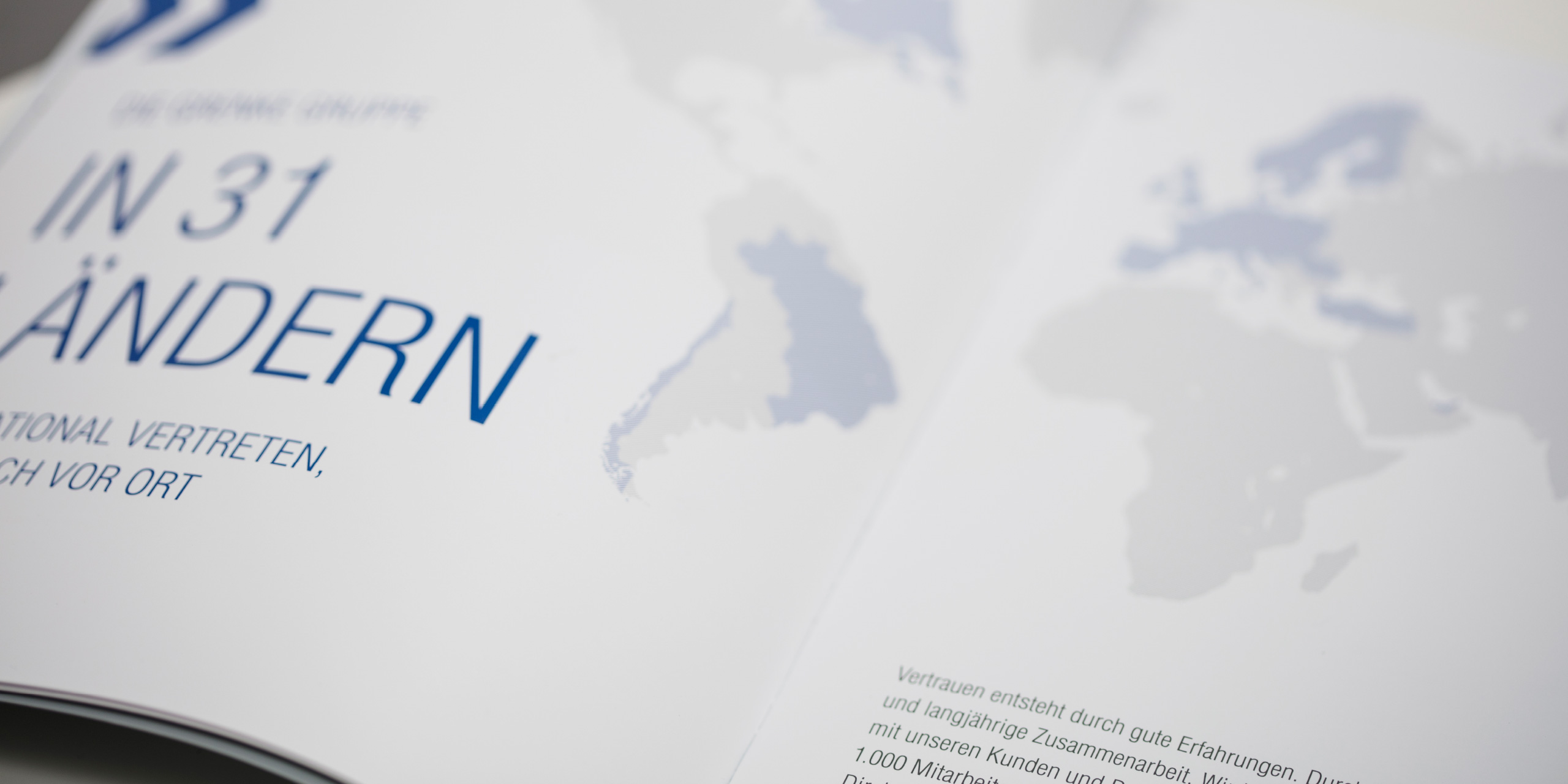
The company was founded by Wolfgang Grenke in 1978 and gradually evolved into a group of companies that operates in 31 countries all over the world. The company focuses primarily on financial solutions in the areas of leasing, banking and factoring for small and medium-sized companies.

